Introduction to Smith Charts
Introduction
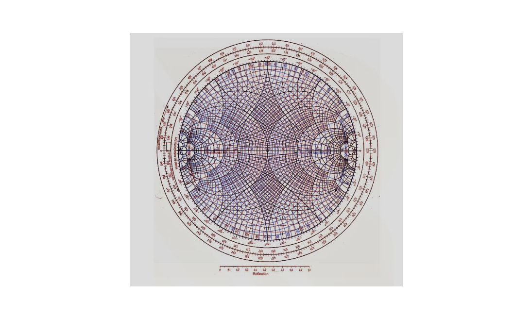
In RF engineering, a powerful tool stands as a guiding light for designers and engineers is the Smith Chart. Born out of the necessity to streamline impedance matching and analysis in radio frequency circuits, this circular marvel has become an integral part of RF design methodologies. At its core, the Smith Chart is a graphical representation of complex impedance. Real and imaginary components of impedance find their place on this circular chart, simplifying the visualization and manipulation of impedance values. By plotting normalized impedance, it allows engineers to swiftly analyze impedance transformations and transmission line behavior.
The Smith Chart also offers an intimate relationship with the reflection coefficient, aiding engineers in understanding the behavior of waves as they encounter discontinuities within a transmission line or circuit.
Using the Smith Chart
In practical terms, the Smith Chart finds its forte in matching circuits. Its visual nature facilitates the identification of optimal impedance matching solutions, enabling engineers to achieve maximum power transfer. This capability proves invaluable in RF circuit design, ensuring efficiency and minimizing signal loss.
Applications and Examples
Consider an example where a transmission line encounters impedance mismatches. By leveraging the Smith Chart, engineers can swiftly identify the necessary matching components to rectify the impedance mismatch, ensuring minimal signal reflections and maximum power transfer.
Graphs and images further elucidate this concept, showcasing impedance transformations and illustrating how the Smith Chart aids in designing matching networks for antennas or amplifiers.
FAQs:
Q: What is the primary purpose of the Smith Chart?
A: The Smith Chart simplifies the analysis of impedance matching and facilitates the design of RF circuits by providing a visual representation of complex impedance.
Q: How does one read a Smith Chart?
A: The outer circle represents normalized impedance, while the inner circles denote constant resistance or reactance values. Engineers use this chart to analyze impedance transformations and matching networks.
Q: Can the Smith Chart be applied to digital circuit design?
A: While primarily used in RF engineering, the Smith Chart’s principles can be adapted to impedance matching challenges in high-speed digital circuits.
The Smith Chart stands as a beacon in the complex landscape of RF engineering. Its graphical representation of impedance, seamless connection to reflection coefficients, and application in impedance matching solidify its position as an indispensable tool for RF circuit designers. Delving deeper into its intricacies can unlock a world of possibilities in optimizing and perfecting radio frequency designs. This primer merely scratches the surface of the Smith Chart’s capabilities. Exploring its nuances and mastering its applications promises a richer understanding of RF circuit design and analysis.
Understanding the Smith Chart
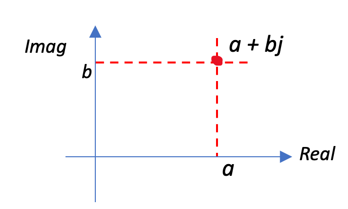
Let’s begin with a straightforward example to refresh our understanding. Imagine a two-dimensional axis, with the horizontal line representing the real part and the vertical line representing the imaginary part of a complex number. This axis accommodates any impedance, irrespective of it being negative or positive. For instance, consider an impedance represented by a point on this axis, say at a position denoted as a + bj in the figure. This point signifies my impedance.
The essence remains unchanged when we delve into the Smith Chart. It encapsulates this idea, enabling any chosen point on the chart to correspond to a specific impedance value. What makes the Smith Chart exceptional is its ability to encompass the entire spectrum of impedances – both real and imaginary, spanning from zero to infinity. Essentially, it’s a 2D representation that comprehensively covers all the conceivable real and imaginary parts of impedances.
Before delving into plotting impedances on the Smith Chart, understanding normalization is crucial. Every impedance represented on the Smith Chart isn’t the original impedance; it undergoes a process of normalization. Let’s explore how normalization is achieved. Assuming a characteristic impedance (Z0) of 50 for our design, let’s consider an original impedance, Z1, expressed as R + jx, akin to the previously mentioned a + bj. However, it’s important to note that we don’t directly represent R + jx on the Smith Chart. The initial step involves normalizing this impedance.
To normalize, we perform a division operation: Z0 divided by Z1. This computation results in a normalized impedance, which is the value we’ll plot on the Smith Chart. This normalization process is essential before any impedance is placed on the chart for accurate representation and analysis.

We want to find original impedance for centre of smith chart. What is the original impedance when the characteristic impedance is 50. So z1 is going to be 50 multiplied by centre of smith chart which is 1.
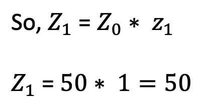
The normalized impedance, at the center of the Smith Chart is obtained by multiplying the characteristic impedance (Z0) by the value at the center, which is 1. Therefore, Z1 = 50 * 1, resulting in an original impedance of 50. It’s essential to note that at the center of the Smith Chart, the impedance is purely real and equals the characteristic impedance. This holds true for any Smith Chart; the center signifies the characteristic impedance. For instance, if the characteristic impedance were 100, then the original impedance at the center of the chart would also be 100. Hence, the center of the Smith Chart directly represents the characteristic impedance, emphasizing its significance in impedance analysis and design considerations.
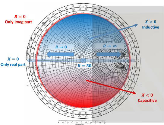
As we navigate towards the right side of the Smith Chart, the real part of our impedance tends towards infinity. Conversely, moving to the left leads us to zero impedance, signifying the extremes of the real part, R.
On the Smith Chart, the horizontal line marked in red represents the real axis. Any impedance positioned on this line signifies a purely real impedance, devoid of any imaginary part. This axis spans from 0 to infinity in terms of real impedance values, showcasing the range of possibilities for the real part, R. For instance, considering a characteristic impedance of 50, if a point labelled as 4 on the Smith Chart represents a normalized impedance, the calculation to derive the original impedance at this point involves multiplying the normalized impedance (4) by the characteristic impedance (50). This computation yields a real impedance value of 200. Therefore, at point 4 on the Smith Chart, the original impedance is 200, demonstrating how the chart facilitates easy determination of real impedance values for different normalized positions along the real axis.

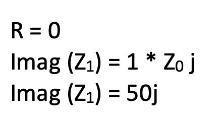
On the Smith Chart, the red circle signifies the imaginary part of the impedance. For instance, considering a point labelled as 1.0 on the Smith Chart, where the real part is 0 and the normalized position indicates an imaginary part of 1.0 times the characteristic impedance (Z0), which is 50, the calculation yields an impedance of 50j.
It’s important to note that while the Smith Chart doesn’t feature negative real parts, it accommodates both positive and negative values for the imaginary part. This division of the chart into upper (positive/inductive) and lower (negative/capacitive) parts delineates this characteristic.
In the upper blue region of the Smith Chart, when selecting an impedance point, the resulting impedance will possess a positive imaginary part. This region is termed the inductive region due to the positive nature of the imaginary component. Conversely, in the lower red region, choosing an impedance point yields a negative imaginary part, categorizing this section as the capacitive region due to its negative imaginary component. This partitioning aids engineers in understanding the nature of the impedance based on the placement of points on the Smith Chart, distinguishing between inductive and capacitive characteristics based on the sign of the imaginary part.
Summarizing the characteristics of different parts of the Smith Chart:
Horizontal Line: Purely represents the real part of the impedance.
Red Circle: Represents solely the imaginary part of the impedance.
Upper Half Circle: Indicates real and positive imaginary parts (Inductive Region).
Lower Half Circle: Depicts real and negative imaginary parts (Capacitive Region).

Regarding finding impedance on other circles and arcs:
Circles with Constant Real Part:
- Any circle chosen will have a constant real part.
- The intersection of these circles with the horizontal line yields an impedance with a real part equal to the characteristic impedance (Z0, in this case, 50).
- In the upper section, any point on the circle will result in an impedance of 50 + jx, where x varies depending on the specific point chosen, while R remains constant.
- For instance, if at R = 0.5, selecting any point on the circle results in an impedance of 25 + jx.
Curves and Arcs with Constant Imaginary Part:
- These curves represent constant imaginary parts.
- Their intersections with the outer circle (having only imaginary parts) determine the impedance.
- For instance, at the intersection 0.5 on a curve, the impedance will be R + 25j (normalized), while in the lower section at intersection 1.0, the impedance will be R – 50j.
Understanding these curves, arcs, and intersections on the Smith Chart allows engineers to precisely determine impedances with constant real or imaginary parts, aiding in impedance matching and design considerations across various points on the chart.
Conclusion
In unravelling the intricacies of the Smith Chart, we’ve explored its fundamental elements and their implications in RF engineering. This circular masterpiece encapsulates a wealth of information within its contours, delineating real and imaginary parts, inductive and capacitive regions, and constant impedance curves. Understanding the significance of each element – the horizontal line for real parts, the red circle for imaginary parts, and the implications of various circles and arcs – equips engineers with a powerful tool for impedance analysis and design. The Smith Chart’s ability to visualize impedance transformations, map out inductive and capacitive regions, and provide a clear depiction of constant impedance values empowers engineers to navigate complex RF systems with precision. Mastering this tool opens a gateway to streamlined impedance matching, facilitating the optimization of RF circuits and fostering innovation in the ever-evolving world of radio frequency engineering.

Learn more about this topic by taking the complete course ‘RF Microwave and Radio Frequency Transmission Theory Online Course – RAHRF200’. Watch the course videos for more detailed understanding. Also checkout other courses on RF system and IC design on https://rahsoft.com/courses/. Rahsoft also provides a certificate on Radio Frequency. All the courses offer step by step approach.

